By Jackson Gianchetta
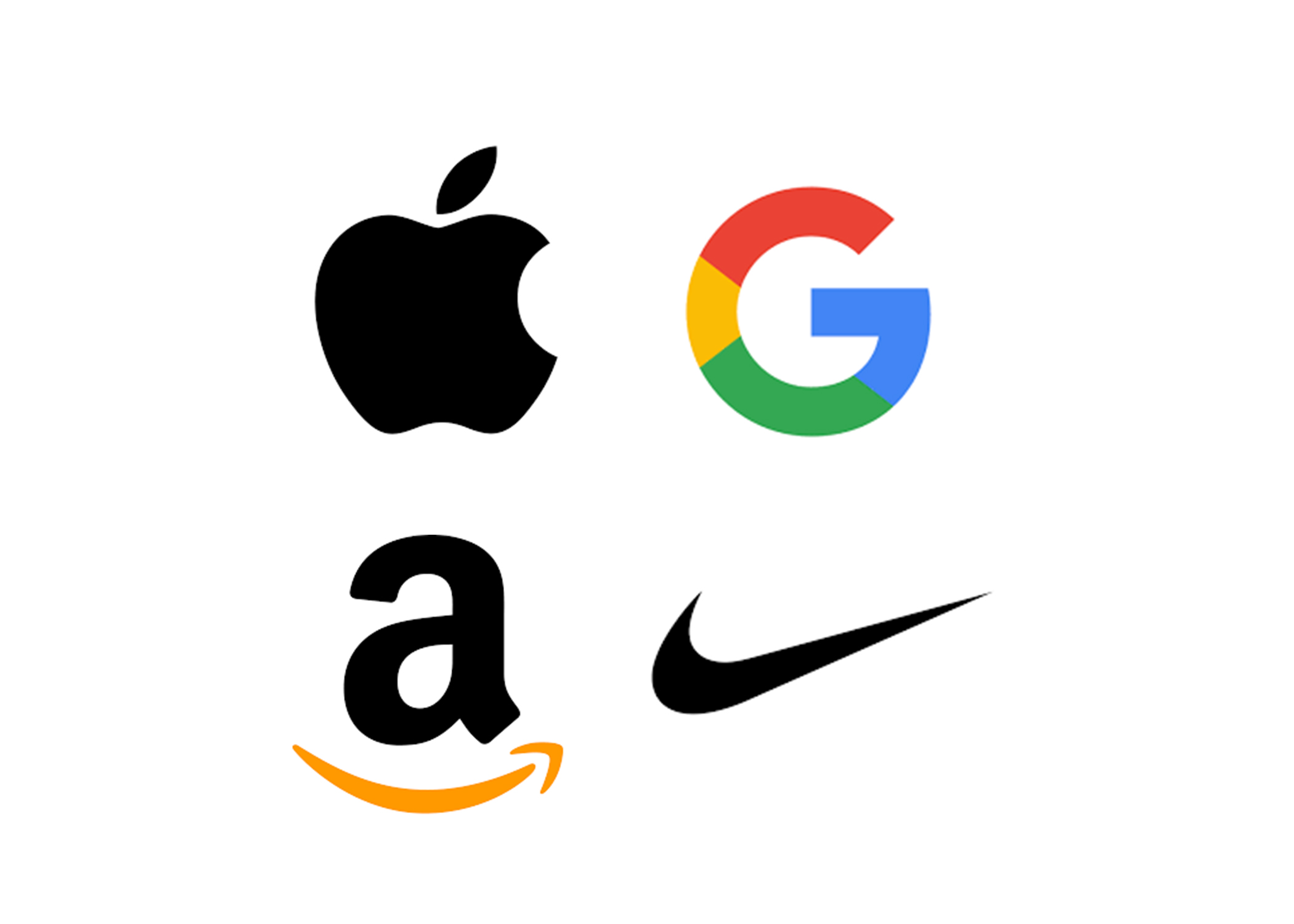
Corporate logos serve as a visual representation of the identity and values of a company. The designs of iconic logos, such as McDonald’s golden arches and Nike’s swoosh, are instantly recognizable across the world. Yet how did these images become standard in the corporate world? How did the logo become an integral part of corporate branding?
To a certain extent, logos have been around since the dawn of civilization. Throughout history, pictures have been used to easily identify certain groups or figures. European monarchs used coats of arms to signify the crown. In Ancient Rome, merchants would use mosaics of exotic animals to express the origins of their goods to townspeople. Members of Indigenous tribes would even use certain symbols or characters to represent their own groups in artwork or writing. The first images used for business sprung up in the Middle Ages as pubs across Europe would use painted signs to stand out in cities, towns, and villages.
The earliest trademarked logo is that of the Bass Brewery in Staffordshire, England. Depicting a red triangle above a cursive wordmark, the now famous design was printed onto glass bottles to help the company’s products become easy to recognize.
With the advent of the modern grocery store around the turn of the 20th century, unique logos and packaging became a necessity to help products stand out on store shelves. Over time, logos became an easy way for companies to represent themselves to consumers. Good logos immediately communicate to any consumer exactly what a brand or product is and differentiate it from competitors. This allows for strong logos to transcend cultural and educational barriers, making corporate logos more accessible than script counterparts.
Over the past century, trends in logo design have come and gone. In the 50s and 60s, many popular logos used bold, geometric shapes and distinct, bright colors. Into the 70s and 80s, logos became more abstract, as many designers began to incorporate gradients and 3D effects. Coinciding with the birth of the Internet, 90s logo designs saw the introduction of cleaner lines and simple shapes, easier to see in the corner of a website on a low-resolution computer monitor. Modern logos have taken this trend even further, with companies opting for simple two-dimensional logos that are easy to reproduce across various platforms.
As trends in logo design evolve, companies look to change their brand identity sparking potentially controversial rebrands. Companies such as Gap, who for a short time changed their famous “Blue Square” logo to a simpler print “Gap” in a variation of the Helvetica font, and Tropicana who simplified their logo and branding to a point where it became hard to find their products on grocery store shelves, are both modern examples of an unsuccessful rebrand. This backlash is representative of a broader disdain for the one-note, monochromatic design language that permeates modern marketing. Recently, more and more consumers and investors feel large corporate rebrands are unnecessary, especially due to the multi-billion dollar price tag generally associated with reinventing brand identity.
Regardless of the current trends, the best logos are able to remain relevant across multiple decades. The best logos are simple, original, and instantly recognizable, they stand the test of time, adapting to ever-changing trends and technology.